
• Welcome to the Yamaha FZ6 Forums. Member registration disables ads and allows you to post and share. Register Here.

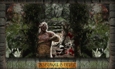
what u think?

it is pretty good, very busy for just a glance, but when you look at it for a few mins you appreciate it all, but if you are looking for something that someone can look at quick then i think that it is too much.


Is the cannibal looking dude you?
 
lol he sure is

and it isnt really a sig. it is just something i had to make. i had an idea and i HAD to make it the way it was in my mind. i had the perfect stock images too.

took me forrrrrrever to make it soooooooo much detail work on it.

i love it.
 
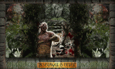
its aztec themed:

panther = personification of quetzlcoatl in aztec religion
statues = ceremonial war-dress
dude = aztec
dead frenchmen = why not? :P gotta sacrifice somebody
up top in centre = bloodthirsty aztec god
skulls in mid-background = sacrifices

:)

then ALLLLL the foliage...cut out piece by piece in some cases.
 
You say that you, "had to make it". Are you taking a photoshop class or something like that? I have a good friend who teaches photoshop and this type of collage is one of his standard assignments.

My comments echo what reiobard alluded to: at a glance, it's difficult to see any one thing. Consider the notion, "when all of the text is bold, no text is bold". Which, when we consider the image at hand would translate to: there's a lack of contrast and depth.

Perhaps playing with the opacity of some of the layers so that there is variation among them. That will help to "ground" things -- bring some things to the fore, and subdue other stuff, blending it to or with the background.

Also, the text at the bottom is rather difficult to read. When using a decorative typeface such as that, it's important that there be strong contrast between it and the background upon which it rests. When there's not enough contrast, such as now, the eye not only has to work on the unusual shapes of the letters but has to do this while trying to "pull" the letters away from the background.

I hope that my comments don't come across poorly. I've sat through plenty of art class critiques and know how it feels to have someone comment on something that I've spent hours working on, believe me I do... I'm trying to help a brother out, that's all.

I might tone down the pulsing glow around you. Instead of it pulsing to a value of 100%, try setting its final value a little lower, like 60%. It's effective for drawing the eye to the subject -- so I get that part -- but ultimately feels a little garish and gimmicky. (again, not meant as a dig just a comment and suggestion)

The selection of images is solid and you look menacing. Maybe just play with the contrast of the different elements and see what comes of it...

Thanks for sharing your project! Keep us posted.
 
MSTEWAR1 is on it. In a prior life I was a graphic designer and a high school art teacher.

I don't know crap about Photoshop, however your composition needs a focal point to draw the eye to. As mstewar1 says the value is about the same for the whole layout. One trick you can use to see value is to squint you eyes. As you do that you'll see the whole design is kinda the same level of darkness, the eye likes variety. Also try to say away from symetrical designs, even on both sides. The eye typcially likes asymetrical designs because asymetry allows the eye to move over the entire composition without leaving it.

If you can find them check out some design books by Johannes Itten. He developed the preliminary course at the Bauhaus in the 1920's. That is the foundation from which almost all American design classes are rooted in. His very basic explaination of composition will help.

Johannes Itten
 
hmm, wasnt expecting such constructive critisicm from a biking forum haha. thanks tho it is actually very helpful info.

i "had" to make it cuz it was bugging me until i made it. no class or anything.

ive never taken a photoshop class just started messing around with it a year ago and got better as time went on. still no pro mind you, but decent enough :P

-the pulsating glow is actually only going up to about 75% but it is blended with one of the more intense blending methods. might change it now that u mention it and see how it turns out.

-i just kind of threw the text on there as it was late after having finished the rest of th eimage.

-and i think toning down the right and left side to draw the eye to the centre might be a great idea. ill try it out and post the edited version in a few days.
 
hmm, wasnt expecting such constructive critisicm from a biking forum haha. thanks tho it is actually very helpful info.

i \"had\" to make it cuz it was bugging me until i made it. no class or anything.

ive never taken a photoshop class just started messing around with it a year ago and got better as time went on. still no pro mind you, but decent enough :P

-the pulsating glow is actually only going up to about 75% but it is blended with one of the more intense blending methods. might change it now that u mention it and see how it turns out.

-i just kind of threw the text on there as it was late after having finished the rest of th eimage.

-and i think toning down the right and left side to draw the eye to the centre might be a great idea. ill try it out and post the edited version in a few days.

I understand what you mean about having to make it. I have had some art ideas back in 04 that I am just now getting around to. Don't worry about the constructive criticism. If YOU like it, then that is all that really matters. I think a lot of my art people don't get, but that is normal IMO. I think your piece is very creative. I love playing with photoshop, too.:Flash:
 
I've sat through plenty of art class critiques and know how it feels to have someone comment on something that I've spent hours working on, believe me I do...

Michael, now I know who to come to when I get stumped trying for a "look" or effect in PhotoShop. Thanks! I learned a couple of things from your post. I'm retired, but continue to do graphic design work, mostly gratis for non-profit groups and organizations, plus some consulting work for a start-up company doing mostly print design (brochures, flyers, tradeshow booth graphics, t-shirt graphics) and know that there's much more capability in PhotoShop and Illustrator than I'm using or know how to use.
 
Lonesoldier, I really do hope that my feedback didn't come across as too ham-fisted. It truly was meant to be helpful and constructive. It takes guts to put one's art out into the world and ask for feedback. And yeah, much of what we make as art really does only need please ourselves. But still, it seems that you're willing to work at it, so good on you, please do post any revisions, it'll be interesting to see the evolution of the project.

As Hellgate has pointed out, there are great art books out there. One of the biggest problems I find with buying any kind of art book is knowing which ones to read and which to avoid. I don't have the magic formula on that one, wish I did, it would have saved me mucho $$ over the years.

I will plug one book for folk who're just getting their feet wet: The non-designer's design book, by Robin Williams (no, not that Robin Williams...). You can find cheap, used copies at amazon for $5. It's not a be-all, end-all book by any means, but it's got good, clear explanations of common design questions.

I pretty much live in photoshop in my job. But after a great many years using the app, I know that I'm still only scratching the surface of the features that it has. I could probably use something a lot less robust to do the sort of stuff I do. :p I gotta give major props to anyone who takes the time to teach themselves photoshop!
 
no worries mst, i do appreciate it. insight to get better is always a good thing and to be appreciated.

i will make the sides a LITTLE less loud, but not a lot, cuz i like the complexity of it. I like that it looks like a jungle and makes you really look at it to get the detail out of it.

as for the text eventually ill put some time into it, for now it was just thrown on.

i have a bunch more projects i made too, ill keep posting them in this thread. :P
 
Back
Top