Business card critique

Your favorite design is:

  • A

    Votes: 31 63.3%
  • B

    Votes: 9 18.4%
  • C

    Votes: 5 10.2%
  • D

    Votes: 4 8.2%

  • Total voters
    49

zmeiaspas

The tall one
Joined
Jul 9, 2009
Messages
567
Reaction score
12
Points
0
Location
Nice, FR
Visit site
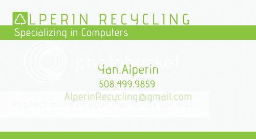
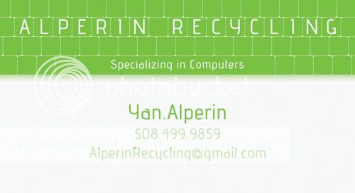
I made a few simple business card designs for my roommate. His company's main activity is the recycling of old / obsolete computer towers.

He's looking to get some feedback so he posted this thread on a couple more forums and this is what he had to add in his threads:


Please vote on your favorite design, and please do give any criticism to help improve my design in any way. My current favorite subtitle is the one on all the designs: "Specializing in computers." Other possibilities are: "A new home for your old computers" or "Helping keep electronics out of landfills." Of course, this is also open for critique. Thanks!

A:

001.jpg


B:

004.jpg


C:

002.jpg


D:

003.jpg


All help, opinions and critiques are more than welcome.

Cheers!
 

lonesoldier84

SuperFlanker Moderator
Moderator
Premium Member
Joined
Apr 19, 2008
Messages
4,463
Reaction score
96
Points
0
Location
Surrey, UK
Visit site
no green is all the rage these days


top card is A by a wide margin. Very classy.

A is win. Please close this thread now.
 

brucey

Junior Member
Premium Member
Joined
Aug 28, 2011
Messages
33
Reaction score
0
Points
0
Location
calgary, Alberta Canada
Visit site
Card "A" is probably the most popular design, but then people might think you're into Kawasaki - ya know, with all that green. We don't want that!
P.S. I voted for card "C", understated and classy.
 
Last edited:

agf

Go Naked- Its liberating
Staff member
Moderator
Elite Member
Site Supporter
Joined
Feb 24, 2011
Messages
2,916
Reaction score
288
Points
83
Location
Melbourne Australia
Visit site
Yeah I gotta say the green on white looks a bit insipid, I know you are prob. looking for a "clean", "green" card but it doesn't come across as solid.
I know it starts mucking up the whole design element but even if you had a black band across the centre of the card about the same height as the vertical green line, or reverse it with blk top and bottom
I do like having a bit of white on the front of a card for scribbling "extra" notes etc
 

Motogiro

Vrrroooooom!
Staff member
Moderator
Elite Member
Site Supporter
Joined
May 8, 2008
Messages
14,998
Reaction score
1,167
Points
113
Location
San Diego, Ca.
Visit site
I like A as it stands but also agre with Kazza on the other one after changing the background to black.

The wording "Keeping electronics out of landfills." instead of "Helping"
 

Kaisersoze

Junior Member
Joined
Jun 13, 2011
Messages
364
Reaction score
3
Points
0
Location
New Jersey
Visit site
D. is the best. You dont want your card to get lost in a sea of other cards. I think D. speaks best to your mission due to the built in keyboard. It looks cool, clean, and has a purpose. It looks fresh too, the white w/ "any other bright color look" is very "apple" and in right now.
 

Wolfman

Member
Elite Member
Joined
Apr 24, 2008
Messages
13,584
Reaction score
127
Points
0
Location
Australia
Visit site
I picked A, a green card will stick out amongst all the white ones, and the type is easy to read, and information easy to glance at.

:thumbup:
 

greg

UK Luchador
Moderator
Joined
Aug 3, 2010
Messages
1,771
Reaction score
12
Points
0
Location
Stockport, UK
Visit site
i was expecting something like this..

:D

[ame=http://www.youtube.com/watch?v=qoIvd3zzu4Y]American Psycho: Business Card Scene - YouTube[/ame]
 

VEGASRIDER

100K Mile Member
Elite Member
Site Supporter
Joined
May 5, 2007
Messages
6,495
Reaction score
127
Points
63
Location
RENO, NEVADA USA
Visit site
You're missing a very critical piece of information:

Business Address.

I have an idea where he's at with the 508 area code, but an actual business address gives the person or business a bit more legitamacy.
 

DDS

Junior Member
Joined
Jan 31, 2011
Messages
166
Reaction score
1
Points
0
Location
England
Visit site
Specializing in computer is a little vauge as it's such a big area.

even so if you want to stick with it I would say "Specializing in computing".

Also note any qualifcations he has "John Smith - MCP"

also get him a domain name so the buisness has some legitimacy - theres no excuse for that and I wouldn't do buisness with a buiness who had a gmail / hotmail account :)
 

LeaN69

Senior Member
Joined
Sep 9, 2010
Messages
260
Reaction score
5
Points
18
Location
CNJ
Visit site
voted for A, everything on the card "pops" and is noticible. B, C and D fade in and after a glance I dont even feel like reading whats on it.
 
Top